Filter
Exclude
Time range
-
Near
VisAnalyticsNYC
💡 Small multiples outperform complex dashboards when comparing across categories. Same axes, same scale, one variable changes. Pattern recognition kicks in instantly. 📊 #DataViz #analytics #datafam #VisualAnalytics
21
JoachimSchork
Using dplyr and ggplot2 in R can significantly streamline your data analysis process, making it easier to work with complex data sets. Here are some key benefits: ✔️ Data Manipulation: With dplyr, you can effortlessly filter, arrange, and summarize your data. For instance, you can quickly identify trends, calculate averages, or aggregate data by various categories. ✔️ Data Visualization: ggplot2 allows you to create compelling visualizations. Imagine creating line charts to track changes over time or scatter plots to explore relationships between variables. ✔️ Efficiency: Both dplyr and ggplot2 are part of the tidyverse, ensuring they work seamlessly together, thus saving you considerable time and effort in data manipulation and visualization. Here’s a simple example of what you can achieve with cryptocurrency data: 1️⃣ Extract the closing prices of Bitcoin and Ethereum over a specified period. 2️⃣ Calculate the index for each cryptocurrency based on their initial closing prices. 3️⃣ Create a line chart with ggplot2 to visualize the indexed price trends of Bitcoin and Ethereum, using different colors to represent each cryptocurrency. I have created a video tutorial in collaboration with Albert Rapp, where I demonstrate how to do this in practice: youtube.com/watch?v=EKISB0gn… Additionally, you might want to check out my comprehensive online course on "Data Manipulation in R Using dplyr & the tidyverse," which covers this and many other related topics in depth. More info: statisticsglobe.com/online-c… #Data #VisualAnalytics #database #tidyverse #Rpackage #Python #DataViz #Python3 #programming #ggplot2
1
7
43
1,739
JoachimSchork
Want to visualize textual data clearly and attractively? The ggpage package extends ggplot2 to create visualizations that resemble the layout of a book page, making it easier to display and analyze text data. Using ggpage, you can: ✔️ Visualize text data in a structured and readable format. ✔️ Explore word distributions and spatial arrangements within text. ✔️ Create engaging visual representations of books, articles, or other long texts. The visualization shown below is taken from the package website: emilhvitfeldt.github.io/ggpa… Thanks to Emil Hvitfeldt for creating this great package! Want to dive deeper? Check out my online course "Data Visualization in R Using ggplot2 & Friends," which explains topics related to ggplot2 in further detail. Further details: statisticsglobe.com/online-c… #Statistical #VisualAnalytics #datastructure #RStats
6
46
2,429
unleashlive
@unleashlive is a Community Sponsor at the MAINSTREAM Asset Management Reimagined Conference, Melbourne, 6-7 Aug 2026. We're also co-presenting a case study on how a major mining operator deployed continuous computer vision monitoring across critical operational zones and high-risk vehicle corridors, reducing manual inspection cycles and building a governed, auditable compliance record across all shifts. Session: Thursday 6 August, 10:40-11:20 AM, Perspective (Data Stage) Visit us at Booth C15. Agenda: hubs.ly/Q04nbTjM0 Book a session while you're attending with our team: Mining & Critical Infrastructure: hubs.ly/Q04n9N3n0 Energy: hubs.ly/Q04n9BCn0 #Mainstream2026 #AssetManagement #computervision #visualanalytics #AIApps #AssetMonitoring #AssetInspections
21
PathDataFan
Nesta dica vamos mostrar como simular uma barra de busca por nome de produto no Tableau, utilizando um parâmetro de texto e a função CONTAINS() Confira: cutt.ly/gt5DCGIe #Tableau #WeAreDataPeople #DataFam #VisualAnalytics #PathDataFan #TableauTips #PathTips
24
JoachimSchork
Robust standard errors improve the reliability of regression analysis by adjusting for variability in errors (heteroscedasticity). Unlike regular standard errors, which assume constant variance, robust standard errors provide more accurate estimates when the spread of residuals varies. Advantages: ✔️ More accurate confidence intervals, especially when data sets exhibit heteroscedasticity. ✔️ Prevents overconfidence in predictions by correctly reflecting areas of increased uncertainty. ✔️ Ensures reliable statistical inferences, leading to better decision-making and more dependable results. Visualization: The graph below illustrates regular vs. robust standard errors. The green area shows regular confidence intervals, assuming constant variance. The red area represents robust confidence intervals, which expand where variability increases, providing a clearer picture of uncertainty. Handling Robust Standard Errors in Practice: 🔹 R: Use packages like sandwich for calculating robust standard errors and ggplot2 for visualization. 🔹 Python: Use modules such as statsmodels for robust standard errors and matplotlib or seaborn for creating clear visualizations. For more insights on data science, statistics, Python, and R programming, check out my email newsletter. More details are available at this link: statisticsglobe.com/newslett… #rstudioglobal #datasciencetraining #RStats #statisticians #Rpackage #database #DataViz #ggplot2 #VisualAnalytics #DataAnalytics
1
3
67
2,255
PathDataFan
A Copa do Mundo de 2026 marca um momento histórico para o futebol mundial, sendo a primeira edição realizada em três países e também a maior em número de seleções. Confira: cutt.ly/ytPv2t7d #Tableau #WeAreDataPeople #DataFam #VisualAnalytics #PathDataFan #CopadoMundo
1
2
51
VisAnalyticsNYC
📊 Wide aspect ratios (roughly 3:2) work best for time series. They help readers perceive rate of change without exaggerating slopes. Too tall? Trends look dramatic. Too wide? Everything looks flat. 💡 #DataViz #analytics #datafam #VisualAnalytics
1
1
71
JoachimSchork
Looking to take your data visualization to the next level? The ggdist package extends ggplot2 with specialized tools for visualizing distributions, uncertainties, and comparing data groups. It’s a powerful add-on to your ggplot2 toolkit, especially useful for communicating complex insights with ease. Key benefits of using ggdist: ✔️ Enhanced Distribution Visualizations: Create rich visuals like eye plots, slab intervals, and gradient intervals, making it easier to interpret complex data distributions. ✔️ Detailed Uncertainty Displays: Add flexible uncertainty intervals to your charts, helping to convey the full range of your data without clutter. ✔️ Improved Comparison Options: Effectively compare groups or distributions in a visual style that remains clear and interpretable. ✔️ Seamless Integration with ggplot2: Works smoothly with ggplot2 syntax, so you can incorporate it into your existing workflow without extra setup. With ggdist, you can go beyond the basics of ggplot2 to build plots that convey more information without losing clarity. This package offers specific solutions for data sets with high levels of uncertainty or multiple comparison groups, ideal for fields like statistics, finance, or any data-driven research. The visualization shown here is an example from the ggdist package website, highlighting its unique capabilities: mjskay.github.io/ggdist/ If you want to explore this and many other related topics, check out my online course, Data Visualization in R Using ggplot2 & Friends. Learn more by visiting this link: statisticsglobe.com/online-c… #database #ggplot2 #R #coding #statisticians #Rpackage #DataAnalytics #datavis #RStats #tidyverse #VisualAnalytics
2
12
94
4,168
JoachimSchork
Influential Observations are data points that can disproportionately impact the results of a regression model. This plot shows the relationship between standardized residuals and leverage, with Cook's distance contours to identify such points. Why are Influential Observations Important? Influential data points can distort the model’s fit, leading to incorrect estimates or predictions. Identifying and evaluating these points ensures that the model remains reliable and robust. How to Interpret the Plot: 🔹 Leverage (x-axis): Measures how far an observation's predictor values are from the mean of the predictor values. Points with high leverage are farther from the center of the predictor space and can have more influence on the regression model. 🔹 Standardized Residuals (y-axis): Shows how far the observed value is from the predicted value, measured in standardized units. Large residuals suggest that the model does not fit the corresponding observation well. 🔹 Cook’s Distance Contours (dashed lines): Cook's distance measures the overall influence of each observation on the fitted regression model. Observations with a Cook's distance greater than 1 are considered potentially highly influential. ✔️ Points within the contour lines (Cook's distance < 0.5): These observations have relatively low influence on the model. ❌ Points near or beyond the contour lines (Cook's distance > 0.5 or > 1): Observations outside or near the dashed lines, such as point 85 in this plot, are considered influential and should be reviewed. They may disproportionately affect the regression model’s coefficients and predictions. In this plot, most observations are well within the Cook's distance contour lines, indicating low influence on the model. The plot was created using the performance package in R. Would you like to dive deeper into statistical concepts like this? Explore my comprehensive online course on Statistical Methods in R. See this link for additional information: statisticsglobe.com/online-c… #Rpackage #DataViz #database #RStats #datasciencetraining #datastructure #VisualAnalytics #datascienceenthusiast
1
4
73
2,590
JoachimSchork
As someone who was born and raised in the Black Forest in Germany, I found this map astonishing to see. 🌲 Milos Popovic recently shared a fascinating 3D map of Germany's forests, showcasing the average tree canopy height. This map, created with R and the packages ggplot2 and rayshader, beautifully highlights the variation in tree canopy height across the country, from the lowlands to the mountains. The visualization provides a unique perspective on Germany's diverse forest landscape. Here are some key points about this map: ✅ Utilizes data from ETH Global Sentinel-2 Tree Canopy Height (2020). ✅ Created with R using ggplot2 and rayshader. ✅ Shows variations in tree canopy height across Germany. To learn how to make impressive maps yourself, I highly recommend checking out Milo's YouTube channel: youtube.com/@milos-makes-map… For regular tips on data science, statistics, Python, and R programming, consider subscribing to my free email newsletter. More info: statisticsglobe.com/newslett… #tidyverse #ggplot2 #R #programmer #RStats #VisualAnalytics #DataAnalytics #Rpackage #datasciencetraining
2
31
1,962
JoachimSchork
Creating plots and running statistical tests separately is a common workflow, but it often leads to unnecessary effort and inconsistencies between your visualizations and results. With the ggstatsplot R package, you can combine both steps into a single, streamlined workflow. Instead of running statistical tests first and then adding results manually, everything is integrated directly into the visualization. Some advantages of using ggstatsplot: ✔ Key results such as p-values, confidence intervals, and effect sizes are included automatically ✔ Pairwise comparisons are added without extra steps ✔ A wide range of statistical tests and plot types are available ✔ Results remain consistent and fully reproducible ✔ Clean, publication-ready graphics with relatively little code The visualization below shows examples of graphs created with ggstatsplot. This approach saves time, reduces the risk of errors, and makes your results easier to interpret and communicate. If you want to improve your data visualization skills, consider joining my online course, Data Visualization in R Using ggplot2 & Friends. The course covers ggplot2 and its extensions, including ggstatsplot, and shows how to create clear, effective visualizations for real-world analyses. Click this link for detailed information: statisticsglobe.com/online-c… #datastructure #DataViz #tidyverse #VisualAnalytics #RStats #ggplot2
1
8
59
2,244
JoachimSchork
Want to perform a wide range of statistical analyses without wrestling with complex code? JASP is a free, open‑source statistical software with a simple graphical interface that makes analysis fast and approachable. It runs on R in the background, giving you reliable results with the ease of point‑and‑click navigation. Key advantages of JASP: ✔️ Conduct analyses entirely through an intuitive point‑and‑click interface ✔️ Rich collection of analyses for both standard and advanced methods ✔️ Produces clear tables and figures that can be refined for publication quality ✔️ Built‑in support for classical and Bayesian frameworks ✔️ Completely free and open‑source software ✔️ Powered by R in the background for reliable statistical computation The image below highlights the variety of visualizations possible in JASP, including bar charts, box plots, seasonal trends, principal component plots, scatter plots, stacked bar charts, and time series displays. These graphics can be produced in seconds and exported for reports or presentations. Images shown here are taken from: jasp-stats.org/ Sign up for my newsletter to receive more hands‑on tips about statistics, data science, R, and Python. For more information, visit this link: statisticsglobe.com/newslett… #Data #DataViz #VisualAnalytics #RStats
19
129
5,117
JoachimSchork
Did you know that you can visualize the results of a linear regression model using a scatter plot? This method is not only intuitive, but also highly effective for illustrating the relationship between variables. 🔹 What's on the graph? In the graph below, you'll see the R programming output of a linear regression model and the corresponding scatterplot. The intercept and beta coefficient are highlighted, making it easy to see how well the model fits the data. 🔹 Why is this useful? A scatter plot provides a clear representation of correlations and predictions, making it an essential visual tool for anyone working in statistical data analysis. Here's the R code, in case you want to reproduce those results: set.seed(683475) x <- rnorm(300) y <- rnorm(300, 2, 0.5) 0.3 * x my_data <- data.frame(x, y) summary(lm(y ~ x, my_data)) library("ggplot2") ggplot(my_data, aes(x, y)) geom_point() geom_smooth(method = "lm") It's important to note that this visualization is primarily useful for models with only one predictor. In real-world modeling scenarios, where multiple predictors are often involved, this approach may not be applicable. Nevertheless, it's a great way to understand the fundamentals of how regression models work. I recently hosted a webinar titled "Data Analysis & Visualization in R", where I delved into the key concepts of regression models and how to visualize them effectively. Following this, I developed a mini-course page where you can access a recording of the live session, as well as exercises, solutions, and a variety of additional resources. Learn more: statisticsglobe.com/webinar-… #VisualAnalytics #database #Data #DataAnalytics #RStats
1
17
82
3,260
KirkDBorne
>> "Data Visualization in Excel: A Guide for Beginners, Intermediates, and Wonks" at amzn.to/43X8X1P ————— #DataStorytelling #VisualAnalytics #DataLiteracy
1
8
52
1,873
JoachimSchork
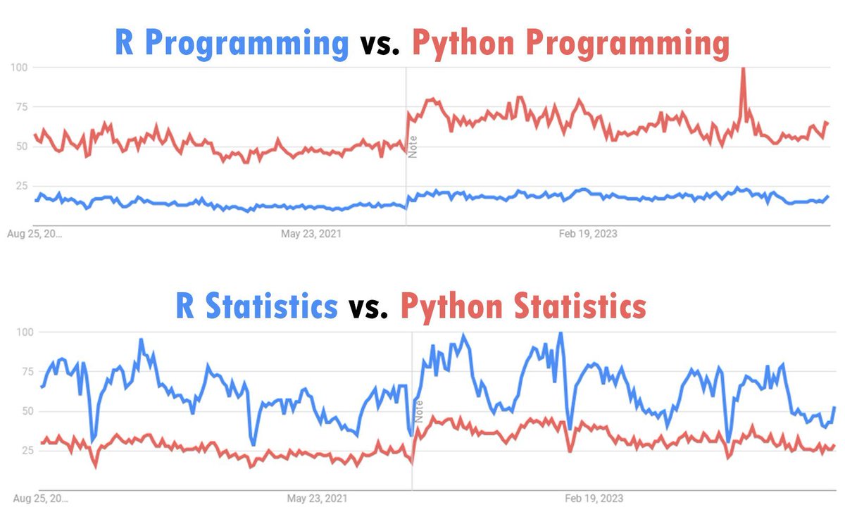
Choosing between R and Python for statistical analysis involves understanding their specific strengths and popularity in different contexts. Python is a versatile programming language, widely favored for its general-purpose capabilities and extensive use in data science and software development. In contrast, R has a strong foothold in the field of statistics, providing specialized tools and packages designed for statistical computing and graphics. The visualization of this post illustrates Google search trends over the last five years, comparing interest in R and Python for programming and statistics. It shows that while Python generally maintains higher search interest overall, R leads when focusing on statistical topics. Here’s a comparison of both languages for statistical tasks: R: 🔹 Highly specialized in statistical analysis and data visualization. 🔹 Offers a wide range of packages specifically for statistical tests, modeling, and graphics (e.g., dplyr, ggplot2, stats). 🔹 Preferred for academic and research-focused projects in statistics. Python: 🔹 Known for its versatility in data science and general-purpose programming. 🔹 Integrates well with other technologies and supports a broader range of applications, from machine learning to web development. 🔹 Utilizes powerful libraries for data manipulation and visualization (e.g., pandas, matplotlib, seaborn, scipy, statsmodels). Generally speaking, the choice between R and Python often comes down to personal preference. Both languages have their unique strengths and can be effective for statistical tasks. However, it's also important to consider the ability to communicate and collaborate with peers. In the field of statistics, R is widely used and recognized, making it a valuable tool for ensuring clear communication and understanding within teams. For this reason, I would always choose R for statistical tasks. If you want to dive deeper into statistical methods in R, check out my online course. More info: statisticsglobe.com/online-c… #VisualAnalytics #datasciencetraining #R #programmer #datastructure #RStats
1
12
74
3,603
JoachimSchork
Clear visualizations are essential in bioinformatics, where datasets often contain high dimensional biological data such as gene expression levels, microbiome composition, or correlations between thousands of variables. The tidyplots R package provides a convenient framework for creating such visualizations using a consistent and readable workflow. Because tidyplots follows a tidyverse style syntax, complex plots can be constructed step by step using clear function calls. This approach helps create informative graphics while keeping the underlying code structured and easy to maintain. Common bioinformatics visualizations that can be created with tidyplots include: 🔹 Volcano plots to identify significantly regulated genes 🔹 Principal component plots (PCA) to visualize sample clustering 🔹 Correlation heatmaps for exploring relationships between variables 🔹 Microbiome composition charts to display relative abundances The visual below shows several examples of bioinformatics visualizations created with tidyplots in R. The examples are taken from the tidyplots website: tidyplots.org/ For regular tips on statistics, data science, AI, and programming with R and Python, you can join my newsletter. More info: statisticsglobe.com/newslett… #RStats #programming #programmer #R #tidyverse #VisualAnalytics #datavis #Rpackage #datastructure #Data
12
60
1,790
JoachimSchork
Create clear and informative box plots with added statistical insights using ggpubr! This package makes it easy to design polished plots that effectively showcase group comparisons and data distributions. ✔️ Visualize Group Comparisons: Box plots are ideal for comparing distributions across categories, showing medians, quartiles, and outliers. Combined with dot plots, they provide a detailed view of individual data points and variability. ✔️ Comprehensive Statistical Annotations: Add statistical comparisons, such as p-values and significance brackets, directly on the plot. The example here includes results from a Kruskal-Wallis test, with pairwise comparisons displayed above to indicate where significant differences exist between groups. ✔️ Customizable Design: Adjust colors, shapes, and labels to make your plots visually appealing and easy to interpret, ensuring they convey the right message. ✔️ Seamless Integration with ggplot2: Works directly with ggplot2, letting you build on your existing plots and enhance them with statistical details without the need for complex syntax. The visualization shown here is from the package website, demonstrating how ggpubr can create polished, publication-ready plots with detailed statistical annotations: rpkgs.datanovia.com/ggpubr/ Ready to master ggplot2 and its powerful extensions to create stunning visualizations? Enroll in my online course, “Data Visualization in R Using ggplot2 & Friends!” Learn more: statisticsglobe.com/online-c… #database #VisualAnalytics #Data #DataAnalytics #RStats
15
73
2,234